Summer is wedding season and whether you’re in a wedding or simply attending, it’s a time for dressing up, visiting with friends and having some fun. Along with these celebrations come gifts and gift giving, and I have a tip I think is worth sharing. The idea is from a friend of mine, but has certainly resonated with me as well!
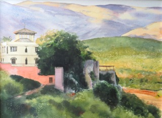
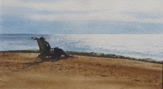
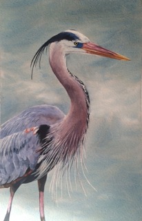
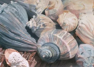
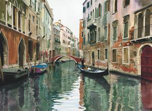
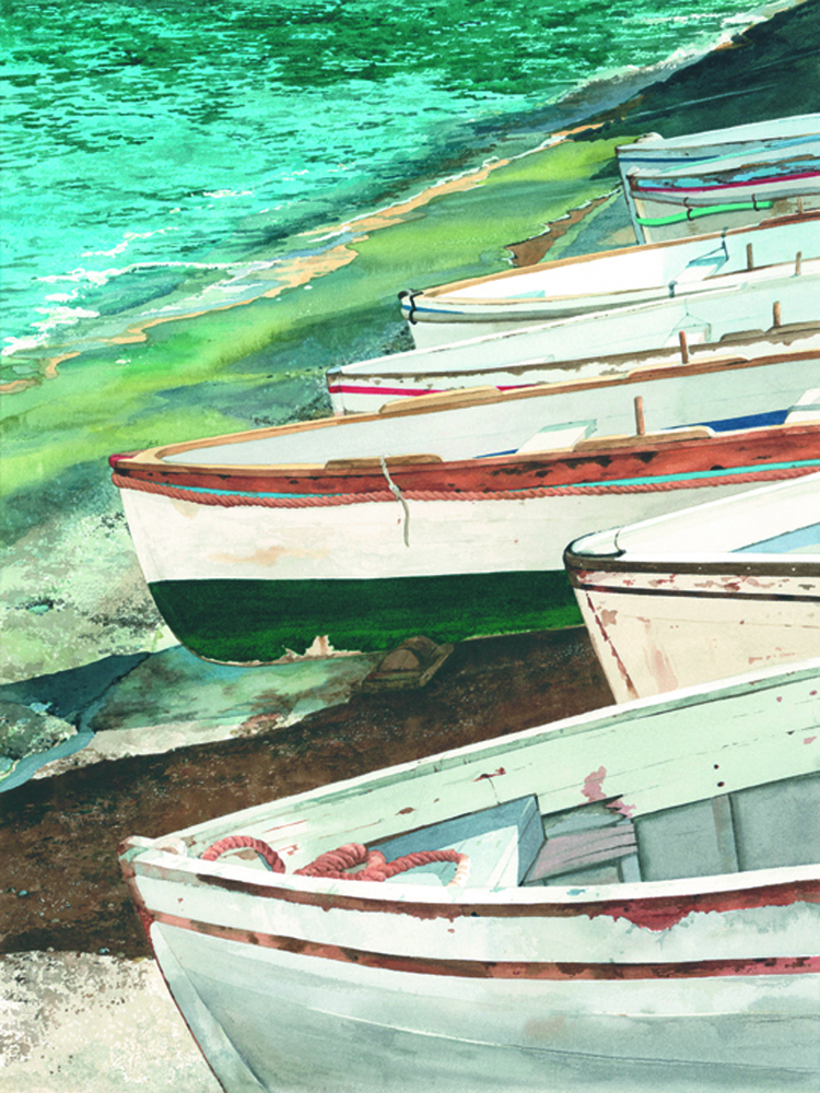
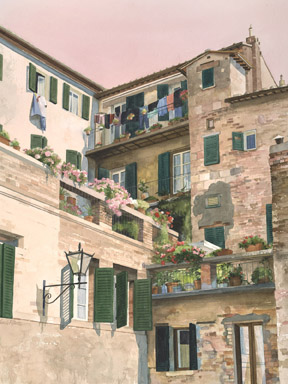
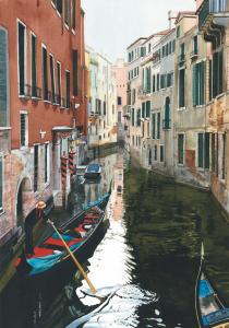
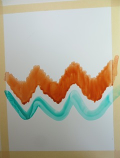
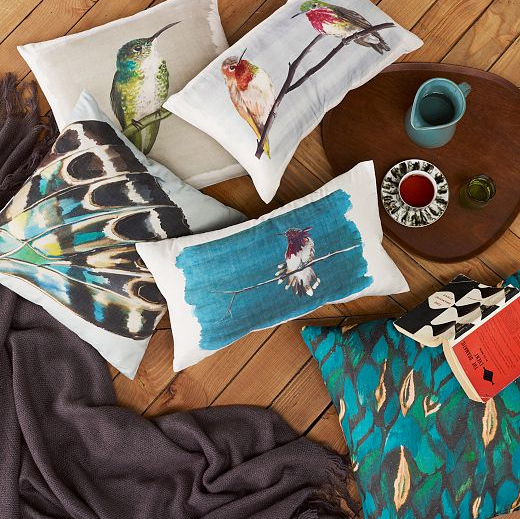
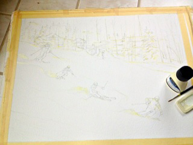
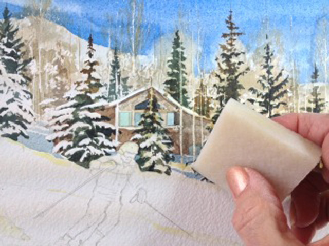
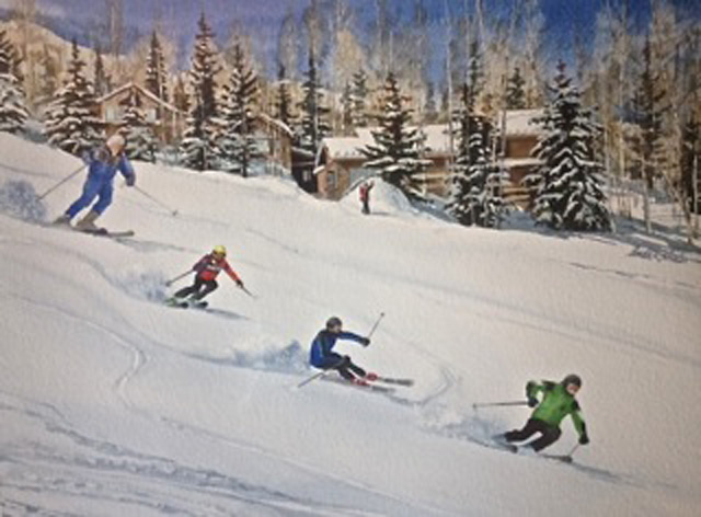
Gene, a wonderful man and family friend, has repeatedly ordered watercolor art to give as wedding gifts. At first you might think, that sounds like a difficult task. How to choose appropriate subject matter, colors and so on? This can be easier than you think! What is at the foundation of every wedding... the couple, right? You can choose an image that represents their connection in a touching or even funny way, and it will be a memorable gift, not just another item from their gift registry.
Here is a Pinterest board that I created containing all kinds of art from many talented artists. Check out: http://bit.ly/ArtWeddingGifts. I guarantee, once you view this board, you will see what I mean!
If you have ever seen art that you think would make a wonderful wedding gift, I’d love to see it! Or, if you have other great wedding gift ideas, please share them. In fact, 3 people who comment will be randomly selected to receive a complementary watercolor gift card set from lindarobertsgallery.com.
I hope to hear from you (click and type in the below comment box). Thank you!
Linda Roberts


